
We've been building more of our Craft plugin control panel interfaces with React lately. Formie 4 and Metrix are the biggest examples of that work, but it's certainly not the only places we want to use it.
So, rather than keeping the useful bits locked away inside one plugin, we're releasing them as a standalone package - @verbb/plugin-kit-react
This package is for Craft plugin developers who want to build richer control panel experiences without solving the same setup, styling, form, and Craft-integration problems over and over again.
Why Build This?
The Craft control panel is great at a lot of things, but once a plugin screen gets more interactive, the old mix of Twig, jQuery, one-off JavaScript, and a few prayers can start to show its age.
Craft's own JavaScript framework, Garnish, has carried a lot of control panel behaviour for a long time, but for plugin developers it can be a tough foundation to build on today. It's jQuery-based, largely undocumented, and can get pretty cumbersome once you're building more app-like interfaces.
For small settings pages, server-rendered HTML is still perfectly fine. We are not suggesting every plugin needs to become a tiny SPA because one dropdown got ambitious.
But for interfaces with complex forms, searchable pickers, drag-and-drop, rich text, conditional settings, previews, modals, or builder-style interactions, React gives us a much better foundation.
Craft 6 (opens new window) is starting to point toward a new Vue/Inertia-based control panel direction, which is exciting to see. It's also still in the early alpha stage, so we're not touching that — yet! Plugin Kit React is about giving Craft 5 plugin developers a practical path right now, and we'll revisit the Craft 6 picture when there's a firmer target to build against.
The tricky part is not just "use React". The tricky part is making React feel like it belongs inside Craft:
- translations should still work
- dialogs and popovers should mount in the right place
- controls should feel at home in the CP
- forms should handle validation and server errors cleanly
- styling should work in normal DOM or Shadow DOM setups
- plugins should not need to reinvent the same build and host-integration pieces every time
That's where Plugin Kit React comes in.
What's Included?
@verbb/plugin-kit-react is the main package for building React interfaces inside Craft plugins.
Under the hood, it's powered by tools we already like working with: Base UI (opens new window) for accessible headless primitives, Tailwind CSS (opens new window) v4 for styling, Valibot (opens new window) for schema validation, Zustand (opens new window) for form state, TipTap (opens new window) and ProseMirror (opens new window) for rich text surfaces, plus supporting pieces like Framer Motion (opens new window) and dnd kit (opens new window).
It includes:
- React components that fit Craft control panel interfaces.
- Form primitives for building consistent settings and editor screens.
- Schema-driven form tools for rendering form UIs from structured data.
- Hooks and utilities for translations, host behaviour, dialogs, portals, and Craft-aware interactions.
- Styling support via
@verbb/plugin-kit-react/style.css. - Helpers for wiring a React app into Craft's control panel environment.
It also brings in the smaller @verbb/plugin-kit utility package under the hood, so most projects should only need to install the React package directly.
Install it alongside React:
npm install @verbb/plugin-kit-react react react-dom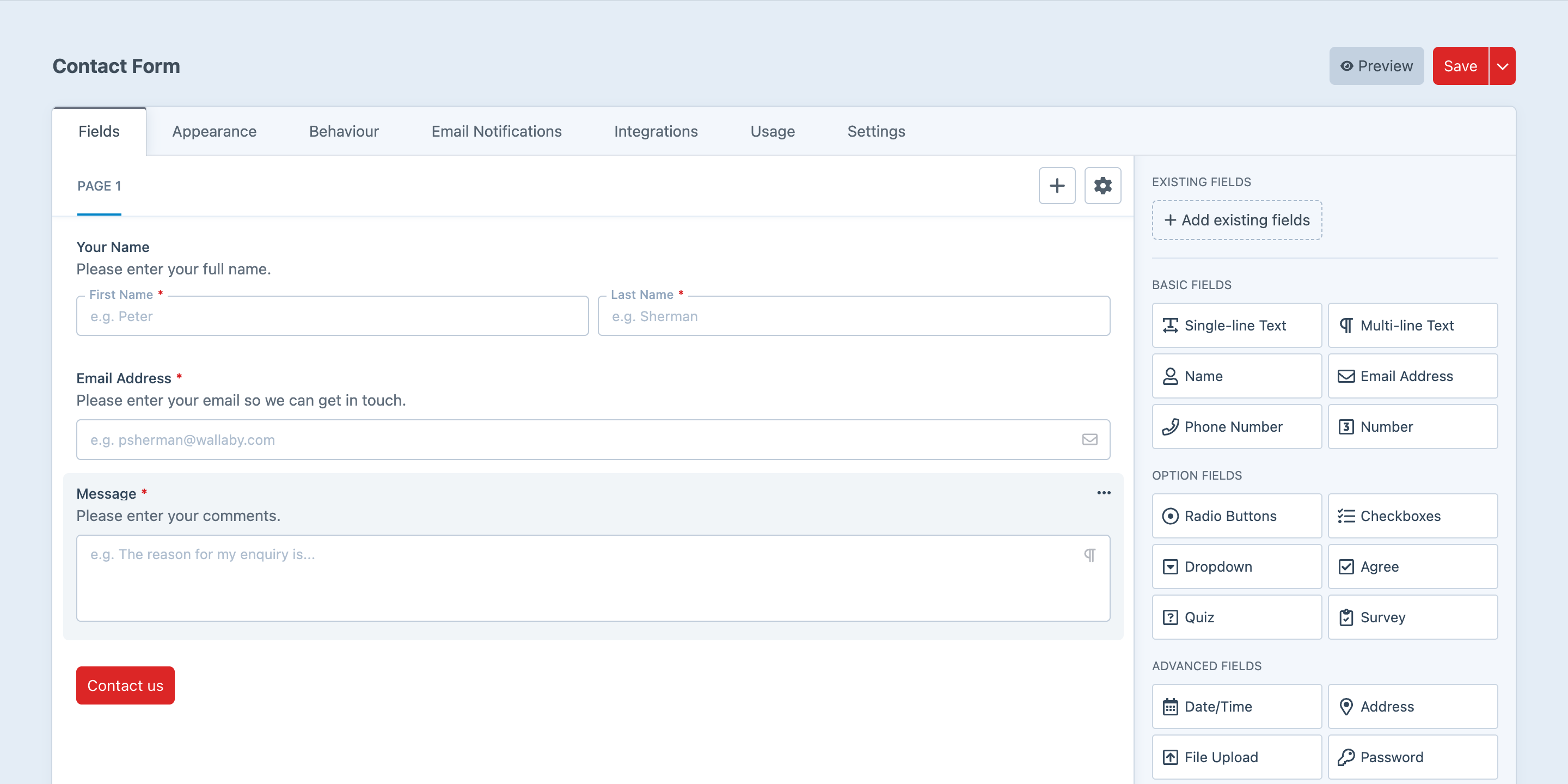
Components That Feel Like Craft
One of the goals of plugin-kit-react is to provide components that feel comfortable in a Craft plugin, without every plugin author needing to make the same choices about sizing, spacing, focus states, menus, popovers, and form controls.
We're also not creating a totally separate design system for Craft. The aim is to follow Craft's control panel patterns wherever they already exist, and only extend them where a plugin needs a richer component that Craft doesn't really provide. Ideally, users should notice the plugin UI is nicer to use, not that it came from a completely different planet.
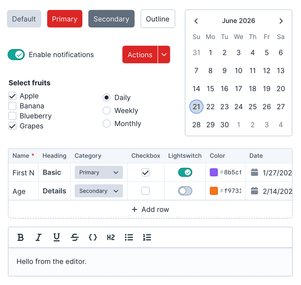
The package includes common building blocks like buttons, inputs, textareas, selects, comboboxes, checkboxes, lightswitches, dialogs, dropdown menus, tabs, tooltips, calendars, date pickers, tables, scroll areas, and more.
Schema-Driven Forms
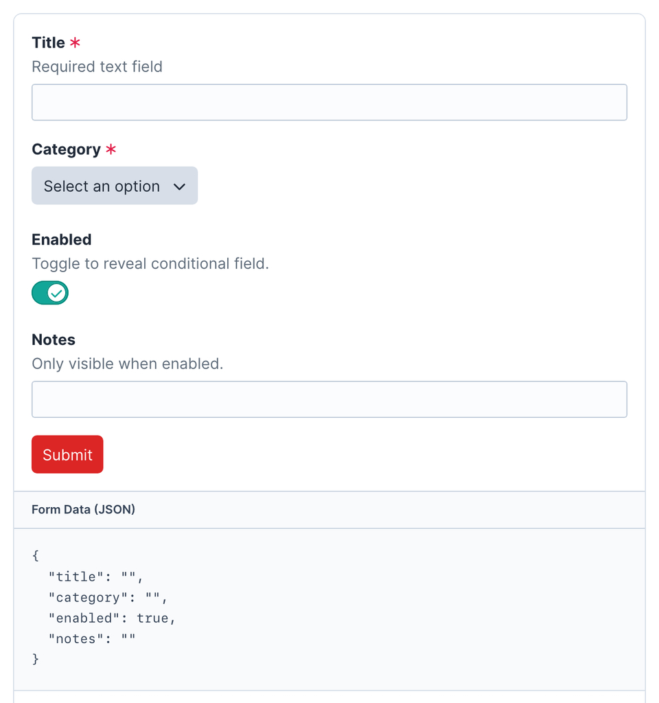
For more complex settings screens, plugin-kit-react includes SchemaForm.
SchemaForm lets a plugin define a form as structured data, pass that data to React, and let the engine render fields, track values, run validation, handle conditions, and submit the final payload.
If you've built Craft plugin settings screens before, the idea should feel familiar. Craft has long provided Twig form macros (opens new window) like forms.textField(), backed by field templates such as field.twig and text.twig.
You might have written something like this in Twig:
{{ forms.textField({
    label: 'Name' | t('app'),
    instructions: 'What this section will be called in the control panel.' | t('app'),
    id: 'name',
    name: 'name',
    value: section.name,
    errors: section.getErrors('name'),
    required: true,
}) }}
SchemaForm is aiming at a similar developer experience for React-powered screens. Your PHP side can still describe the field with translated labels, defaults, validation rules, and errors, while the React side focuses on rendering and interaction.
For example:
$schema = [
    [
        '$field' => 'text',
        'name' => 'name',
        'label' => Craft::t('app', 'Name'),
        'instructions' => Craft::t('app', 'What this section will be called in the control panel.'),
        'required' => true,
        'validation' => 'required',
    ],
];

$formConfig = [
    'schema' => $schema,
    'values' => [
        'name' => $section->name,
    ],
    'errors' => [
        'name' => $section->getErrors('name'),
    ],
];
For example, a plugin can define a schema with fields like:
- text fields
- lightswitches
- selects and comboboxes
- date/time fields
- editable tables
- rich text and variable-picker fields
- grouped or conditional sections
Then React can render that schema through the shared engine.
This has been particularly useful for the kind of plugin screens where the shape of the UI is data-driven, repeatable, or configurable. Which, as it turns out, is a lot of plugin screens.
Built For Craft's Control Panel
A normal React app can render into any DOM node. That part is easy enough.
Craft plugin screens usually need a little more than that. They need to talk to Craft's browser environment, send action requests, use translations, open dialogs, mount floating UI correctly, and sometimes work inside tighter rendering boundaries.
plugin-kit-react includes a small app setup layer for that:
import { createRoot } from 'react-dom/client';
import '@verbb/plugin-kit-react/style.css';

import { App } from './App';
import { configurePluginKitReact, createCraftHostBridge } from '@verbb/plugin-kit-react/utils';

configurePluginKitReact({
  hostBridge: createCraftHostBridge(),
  translationCategory: 'my-plugin',
});

const container = document.getElementById('my-plugin-root');

if (container) {
  createRoot(container).render(<App />);
}
That setup tells the package how to behave in your plugin's CP page. React still renders the UI, but Plugin Kit React knows how to cooperate with the Craft page around it.
Shadow DOM Support
Control panel CSS can get complicated quickly, especially when plugin UI gets more ambitious.
Plugin Kit React supports both regular DOM rendering and Shadow DOM rendering, so plugin authors can choose the level of isolation that makes sense for their interface.
Use the normal setup when your screen should blend directly into the CP page. Use Shadow DOM when you want a more self-contained app surface and tighter control over styles.
If you're not familiar with the Shadow DOM, think of it as a small, private pocket of the page where your app can live. It's still part of the Craft control panel, but its markup and styles are more separated from the rest of the page, which means your app is less likely to accidentally inherit Craft's styling or leak its own styles back out into the CP.
For example, let's say you want to use Tailwind in your plugin's CP screen. In a normal Craft page, that can get messy quickly: Craft has its own classes like flex, already includes a version of Tailwind's reset styles, and has plenty of control panel CSS that was never written with your React app in mind. A Shadow DOM setup gives your app a more predictable styling environment, so using a utility framework, design system, or custom reset becomes much less of a wrestling match.
In the Wild
Formie 4 is the first large-scale proving ground for this work.
Its new builder foundation, richer control panel interactions, variable picker work, schema-driven surfaces, and frontend tooling all pushed us to make the shared layer more reusable. Rather than treating that as Formie-only infrastructure, we've pulled the general pieces into packages that other plugins can use too.
Getting Started
The docs walk through adding a React-powered CP screen to an existing Craft plugin, including the frontend folder, Vite setup, Craft asset bundle, mount element, and first component.
But, if clicking a link is too much work for you:
npm install @verbb/plugin-kit-react react react-domThen import the package styles and components:
import { Button } from '@verbb/plugin-kit-react/components';
import { useTranslation } from '@verbb/plugin-kit-react/hooks';
import { cn } from '@verbb/plugin-kit-react/utils';
import '@verbb/plugin-kit-react/style.css';
From there, you can start small with a single React-powered CP screen, or go further with SchemaForm and the app integration helpers.
Give It A Crack
Plugin Kit React is available now on npm.
We're using it ourselves, and we'll keep improving them as more Verbb plugins adopt the same foundation. If you're building Craft plugins and have been wanting a cleaner way to bring React into the control panel, we'd love you to try it out.
And who knows, if enough Craft plugin developers want the same sort of thing for Vue one day, we might just have to see what happens there too.
As always, if you run into anything weird, get in touch or open an issue on GitHub.
Happy plugin building.