Buttons
Button Box provides fields whose options are presented visually, such as buttons, colour swatches, stars and layout widths. The option label tells the editor what a choice means; its stored value is what your template uses.
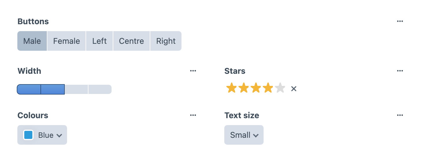
For example, create a Buttons field with the handle layoutStyle and two options: Compact with value compact, and Detailed with value detailed. Add it to an entry layout, select an option and save the entry. In that entry's template, use the selected value to choose the output:
{% if entry.layoutStyle.value == 'detailed' %}
    <p>Additional details for this entry.</p>
{% endif %}
This example relies on the Buttons option value, not its editable label. Keep template values stable when renaming labels. The following settings control how editors make that selection.
Display as Graphic
Toggle this on and Button Box will not restrict the height of the buttons to allow for larger images. For example you might want to allow the user to choose a layout:
Display Full Width
If you check this Button Box will allow the button group to flow full width, useful for allowing larger graphics to be more responsive.
Buttons
- Option label: The name of your option (e.g. ‘Male’, ‘Female’, ‘On’, ‘Off’, ‘Cat’, or ‘Dog’)
- Show label?: Hide the label on output.
- Value: This appears in your template.
- Image URL: The path to your image. Image URLs are relative to your
@webroote.g./images/align-left.pngishttp://site.test/images/align-left.png. Icons work best when they are 30 x 20px or less. - Default: Optionally choose one row to define as your default option for users.
Colours
Create a select drop-down of colours.
- Option Label: Name of your colour (e.g. 'Grey', 'Orange', or 'Mountain Honey Dew')
- Value: This appears in your template and will most likely be a CSS class name
- Valid CSS Colour: This creates the preview colour and just needs to be valid CSS (i.e. CSS colour names, Hex, RGB or RGBA values should all work for you).
- Default: Optionally choose one row to define as your default option for users.
Text Size
Give your users some preset text sizes.
- Option label: Give your size a name e.g. (e.g. ‘Normal’, ‘Large’, or ‘Small print’)
- Value: This appears in your template and will most likely be a CSS class name, or a size value used by your template.
- Pixel Size: This is the size the option will appear in your select menu – it does not necessarily need to correspond to the font-size you want to use on the front-end.
- Default: Optionally choose one row to define as your default option for users.
Stars
Choose the number of stars available for the rating. Editors select a whole-star value; half-star ratings are not supported.
For a Stars field with the handle rating, render the saved numeric value directly rather than accessing an option label:
<p>Rating: {{ entry.rating }}</p>Choose a rating, save the entry and check the number on its page. An unset rating should be handled according to your content requirements.
Width
Use Width to offer a fixed set of layout widths or column counts. For example, a block could offer narrow and full-width layouts, with each option storing the CSS class your template uses for that layout.
Each row you add, creates an extra box.
- Value: This appears in your template and will most likely need to be a CSS class name.
- Default: Optionally choose one row to define as your default option for users.
For a Width field with the handle contentWidth, use its selected option value in your template:
<div class="{{ entry.contentWidth.value }}">
    {{ entry.title }}
</div>
Define the corresponding CSS classes in your site. Selecting a width changes the stored option; Button Box does not supply your public site's layout CSS. Colours and Text Size also use option values, accessed with .value, so a preview colour or size in the editor does not automatically style the public page.
Triggers
Triggers adds action buttons to an editor's field layout. Configure each row's label and Trigger Type, choosing Link or JavaScript, then supply its HREF or Custom JS value. For example, a Link trigger can open your team's editing guide in a new window. Add the field to a layout, open an entry and check that the button reaches that guide.
Use Triggers for editor actions rather than a visitor-facing selection. JavaScript triggers run the configured code in the control panel; use them only for an intentional action you maintain.