Rating
Rating gives authors a whole-number scale for scores, recommendations or reviews. Create a Button Box - Rating field under Settings → Fields, then add it to the field layouts that need it.
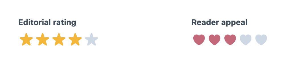
Configuring Ratings
Rating stores a whole integer from 1 to the configured maximum, which can be between 2 and 20 and defaults to 5. An unset or cleared field stores null, not zero. An optional rating clears when authors choose its current value again or press Delete on it; turn on Show clear button in Appearance to also show a clear button. Configure the maximum, an optional default, a star, heart, circle or diamond symbol, active and inactive colours, and optional visible numeric labels. Every step retains an accessible numeric name regardless of its visible symbol.
Fractional ratings are not supported. Use another field when halves or arbitrary decimals are part of the content model.
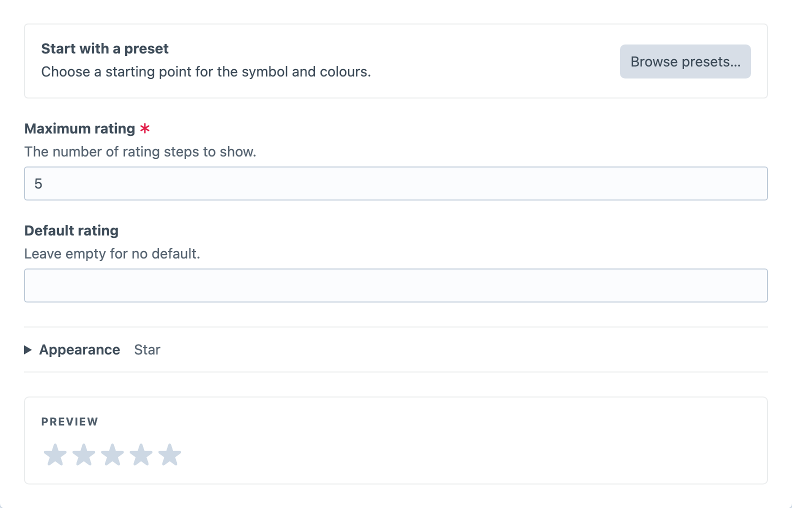
Presets and Appearance
Choose Stars, Hearts, Circles or Diamonds from Browse presets… for yellow stars, pink hearts, blue circles or purple diamonds. Choosing a preset copies its symbol and colours into the field immediately, preserving the maximum, default, clearing behaviour and numeric-label setting. You can then customise the copied settings in Appearance.
Appearance contains the symbol, active and inactive colours, and Show numeric labels. Its collapsed summary describes the current appearance. The live preview remains visible beneath it and updates as you edit; choosing a rating in the preview does not change the field’s default.
Using the Value
For a Rating field with handle editorialRating and a maximum of five, use this in the entry’s Twig template. Replace five with your configured maximum:
{% if entry.editorialRating is not null %}
    <p>Editorial rating: {{ entry.editorialRating }} / 5</p>
{% endif %}