

Button Box is a collection of small fields that make an edit screen a little nicer than a plain dropdown — buttons, colours, text sizes, stars, widths and triggers. It's been around since the Craft 2 days, and we've looked after it since taking it over from the team at Supercool in 2022.
Button Box 5.1 (opens new window) is the biggest update it's had in that time. We've reworked almost every field, added a few new ones, and made setting them up a lot more visual, while making sure your existing fields keep working exactly as they are. We're pretty stoked with how it's turned out.
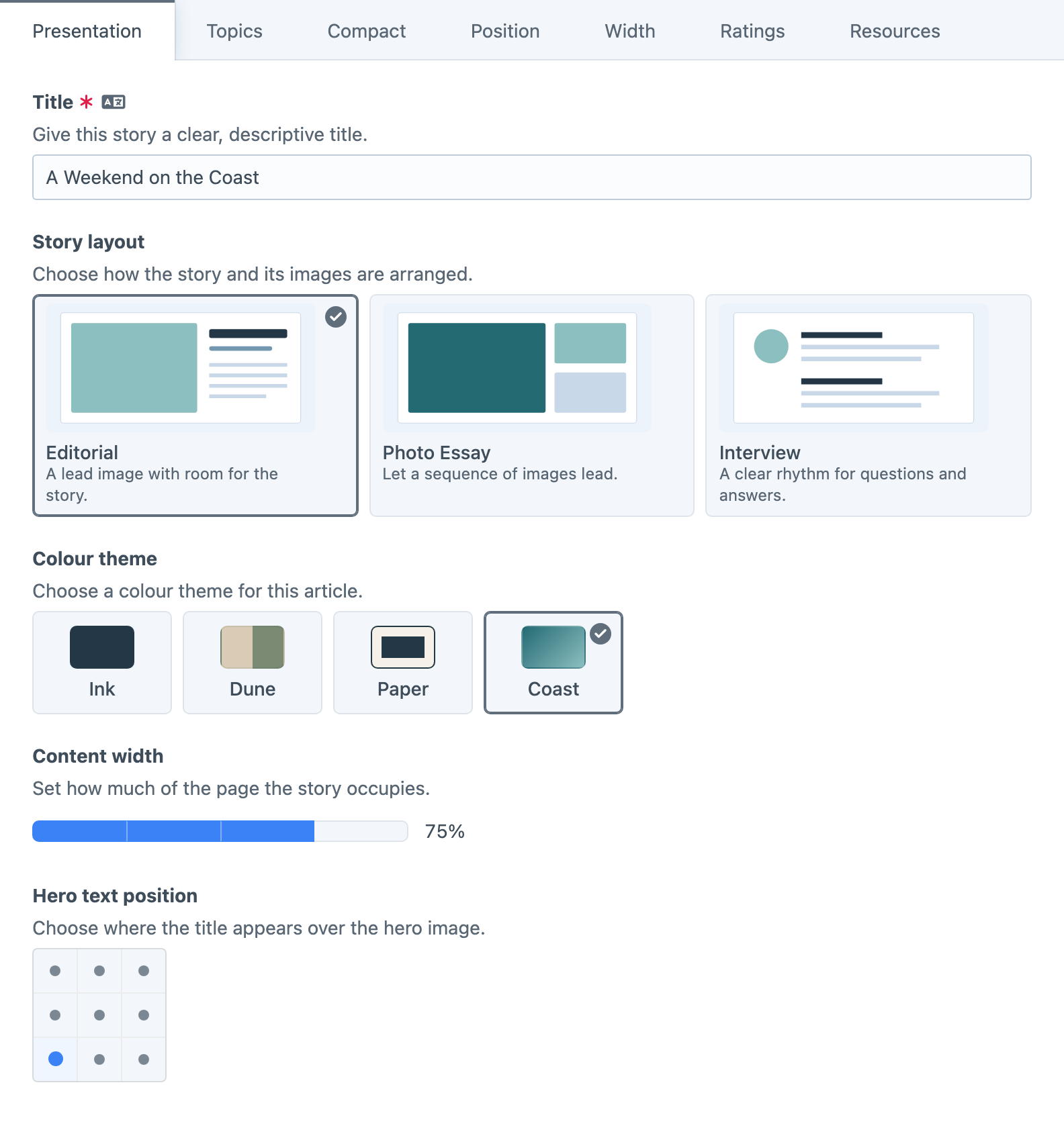
One Field for Visual Choices
Buttons, Colours and Text Size each had their own way of showing options, which meant a nice idea in one field didn't help the others. Visual Choice brings them together, so any set of options can be shown as buttons, cards, tiles or a dropdown, whether it's layouts, colours or text sizes.
If you're wondering about your existing fields, they're fine. More on that at the end.
Use buttons for a compact set of options, cards when an image and a short description would help, or tiles when the picture can do most of the explaining. Cards and tiles also give thumbnails far more room than a button ever could, which makes a real difference when the options are page layouts or design variations.
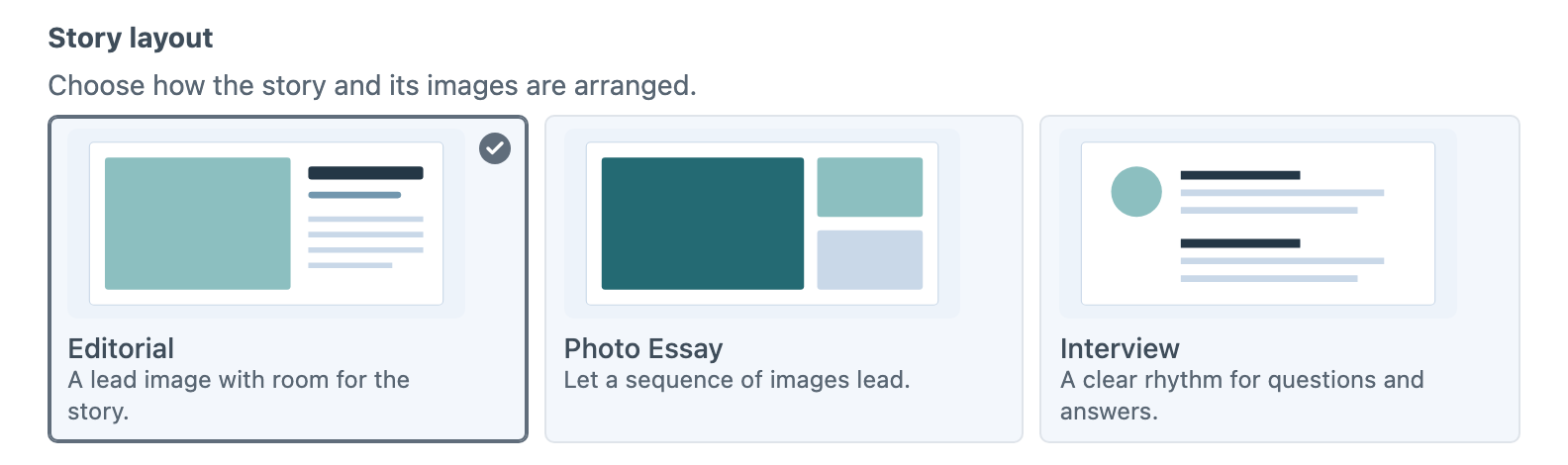
Options can use icons, your own artwork from an image gallery or Craft assets with public URLs, and a description. As always, your project decides what each choice actually does on the website.
When one choice isn't enough, Visual Multi-Choice works the same way but allows several selections, with optional minimum and maximum limits. Think article topics, or the facilities a venue includes.
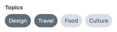
The Visual Choices guide covers each presentation and its settings.
Colours, Gradients and Combinations
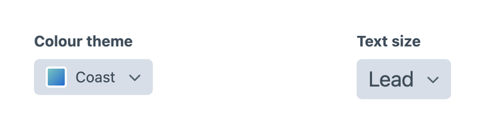
A button or section background is often more than one solid colour, and keeping solid colours in one field and gradients in another gets fiddly fast. Swatches now handle all of that in one field. Alongside solid colours, a swatch can show split colours, a foreground and background pair, or a gradient, so an editor can pick the whole combination by how it looks instead of remembering its name. You can also tweak a swatch's preview colours later without changing the value saved in every entry that uses it.
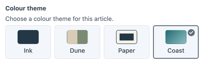
The colour and text-size dropdowns are still around too, now as a Dropdown presentation of Visual Choice. The selected colour keeps its swatch, and text sizes are previewed at their actual size in both the menu and the selected value.
Position and Width
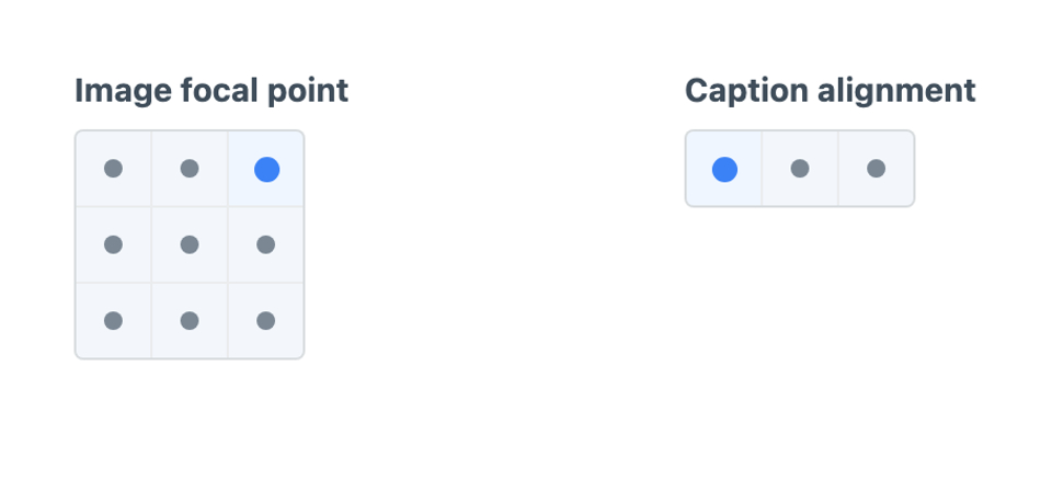
Some settings are much easier to point at than to describe, like where a heading sits over a hero image or which corner a badge belongs in. That's what Position is for.
Position lets an editor pick from a row, a column or a grid, including the classic nine-point layout. Start from Focal point, Horizontal alignment, Vertical alignment or Four corners, then rename the options, change their stored values or switch positions off to suit your project. Arrow keys move around the grid the way it looks on screen.
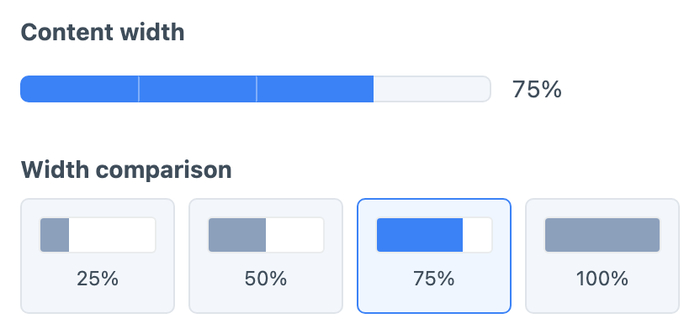
Width has had a similar makeover. Show it as a bar that fills up to the selected width, or as separate samples, and start from Halves, Thirds, Quarters or Grid columns. The label, the stored value and the percentage shown are all separate, so a choice can be called “Wide”, store wide and show as 75%.
The Position and Width docs explain their settings and the values you get in your templates.
Presets and Option Sets
Setting up a field used to mean typing out an options table from scratch and saving, then opening an entry to see what it looked like, deciding it was wrong and heading back again.
Now you can start from a preset. Pick one from a visual chooser, with starting points for typography, aspect ratios, shapes, spacing, colour schemes and more, and a live preview shows the real field as you change it. Position, Width and Rating have presets of their own too.
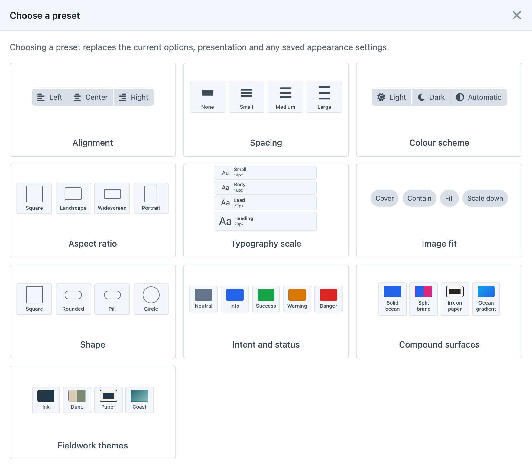
The options editor itself has been rebuilt around inline visual controls. Edit labels and values side by side, browse for an icon, pick colours and drag rows into order, with the extra details tucked into a dialog until you need them.
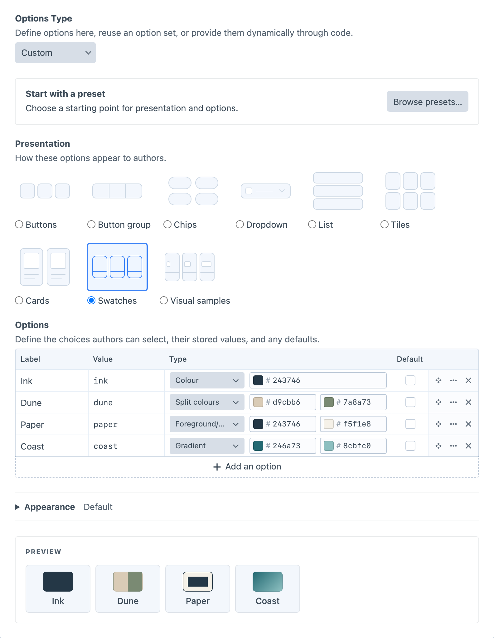
Got a set of layouts or brand colours you reach for on every project? Create your own presets in Button Box's settings, or duplicate and customise a built-in one. They're stored in project config, and built-ins can always be restored.
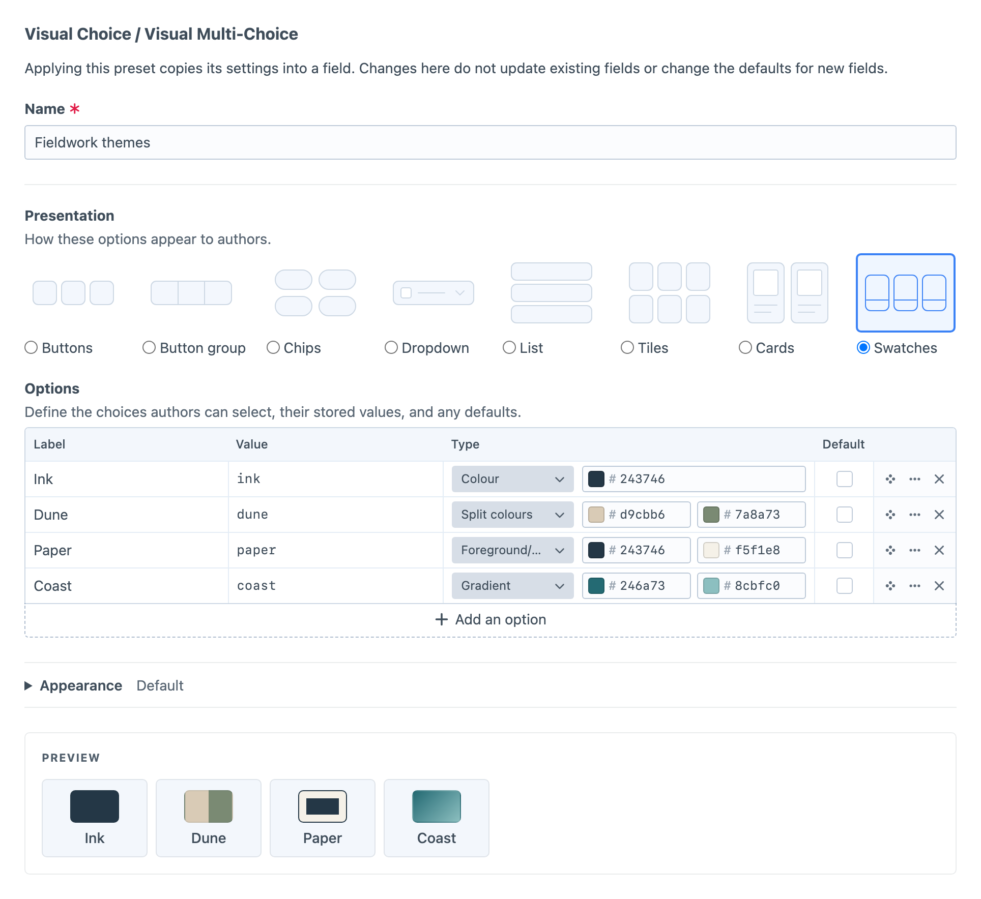
And for choices that should stay the same everywhere, there are option sets. Essentially these are shared options across many fields, so you don't have to type the same options (and maintain them) in multiple places. Edit a set in a slide-out right from a field's settings, and every field using it updates. If one field needs different options later, Convert to Custom gives it an independent copy.
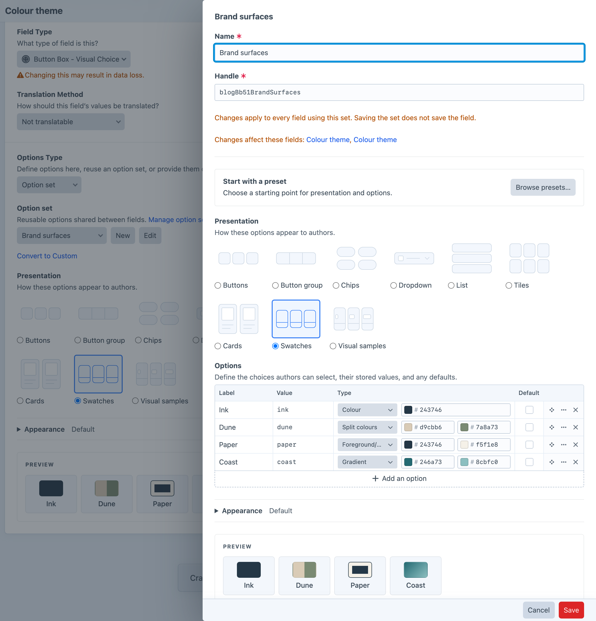
Read up on presets and option sets. Developers can also provide options from PHP when they come from your own project logic.
Ratings and Action Links
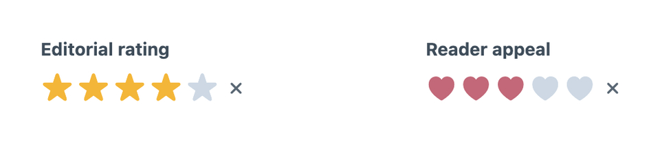
Stars is now Rating, with Stars, Hearts, Circles and Diamonds to choose from, your own colours, a configurable maximum and a live preview in its settings. It also changes how defaults behave. The original fields could swap a value someone had chosen for the field's default, which isn't how Craft fields usually work. In Rating, an empty rating stays empty instead of quietly becoming a score.
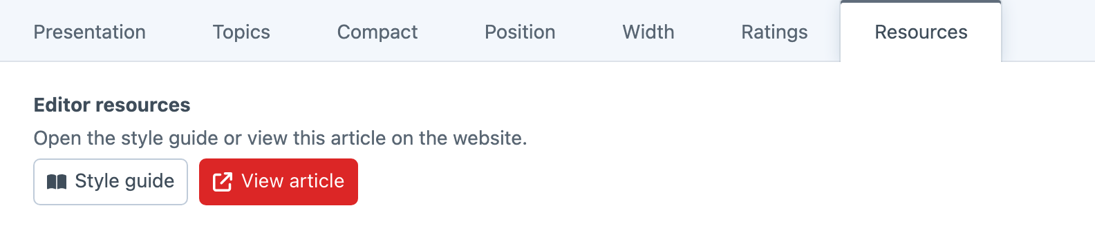
Triggers is now Action Links, for putting handy shortcuts in front of editors, like the style guide, a related control panel page or somewhere specific to the entry. Set up the labels, icons and button styles once, then place the field wherever it helps. These are links in the control panel only, so they don't save anything to the entry or appear on your website. The Action Links guide has the details.
More to Work With in Templates
Visual Choice and Visual Multi-Choice now give your templates each selected option's description, image and colour details along with its value and label. So if an editor picks the Coast theme, your template can use its colours directly, without a separate lookup table to keep in sync. The same details are available over GraphQL for headless sites.
See Using Field Values and the GraphQL guide for examples.
Upgrading
Your existing Buttons, Colours, Text Size, Width, Stars and Triggers fields keep working with the same controls, stored values and templates. They're labelled as legacy fields now, and updating doesn't convert anything automatically. We'd rather you choose when to switch than have an update change your fields for you, and there's no rush. The legacy fields aren't going anywhere in Button Box 5.
When you're ready to move a field across, the CLI conversion tool previews the change and flags anything that needs a look before you apply it. The 5.1 upgrade guide walks through it.
Wrapping Up
Thanks again to Supercool for creating Button Box and trusting us with it. The full changelog has everything else, and GitHub (opens new window) is the place if something isn't behaving.
Button Box 5.1 (opens new window) is available today for Craft 5, and it's still free.