It's time to share our latest plugin, Vizy. It's a visual editor field for Craft CMS which aims to take the good parts of a WYSIWYG field, and super-charge them with Matrix blocks, a better rendering workflow, and more. We like to think of it as a combination of Redactor (opens new window), Matrix and Neo (opens new window) fields.
So how does it work, you may ask? Our best recommendation is to try it out below!
The content for a Vizy field is all stored in JSON blocks, rather than the static HTML other WYSIWYG fields do. This gives you total control over the output of a field. The tabs above show an example output of how your content might look on the page, as well as insight into how the JSON is actually stored.
So why another WYSIWYG?#
Great question - does the world really need another WYSIWYG? Well, yes and no.
Firstly, for Craft, there's historically only been a few options - Redactor (opens new window) and more recently CKEditor (opens new window), which both do a fine job, but produce raw HTML for use in your templates. We love the modern approach of a block-based WYSIWYG field. It's a neater and cleaner way of storing content, so you're not bound to raw HTML.
For a practical example, we use Tailwind (opens new window) extensively, but this poses a problem for the HTML in a WYSIWYG field. Say, we want to add mb-4 to the bottom of every <p> tag, because Tailwind is un-opinionated about paragraph tags. For a Redactor field, we'd have to parse the HTML and add in those classes. This gets a whole lot more work when introducing other HTML elements - Headings being another great example. To get around this, we've wrapped rich text content in a .richtext class and setup custom CSS for any elements inside that class.
With content stored as blocks, we're free to iterate over those blocks and output it just how we like.
We certainly didn't want to build yet another editor to an already overgrown space, which is why we looked to tiptap (opens new window) which has been amazing to work with. Tiptap itself is also built on top of ProseMirror (opens new window) which is used on some pretty notable sites such as Atlassian and the New York Times. More importantly, the extensibility of these frameworks is what drove our decision, where we've used it on Formie to handle picking variables in text fields, and a basic rich text editor.
Matrix, Neo and blocks#
So the above ticked-off our desire for a better WYSIWYG. But our long-time gripe has always been mixing plain-text (formatted) content and the rest of what Craft has to offer.
Imagine this scenario, you have a long-form content page - not too dissimilar to this blog post - where you have rich text content, along with other sections of content. Maybe you have a "Image with Text" block to have an image and text alongside one another. Or maybe a "Table" field to show pricing, of comparing features. While some of these are possible through WYSIWYG editors (with varying degrees of success), they're not the most flexible. In the most-case, you're forced to jump into JavaScript to create custom buttons for advanced functionality.
It's also true that you could use Matrix fields to solve this, where a "Rich Text" block would contain your WYSIWYG editor, and other blocks for other advanced fields. However, the visual overload this presents, particularly for large content builders gets a bit more for content editors. Historically, this is where Neo (opens new window) comes in, through its introduction of tabs, being able to use existing fields, and infinite nesting.
So that's the story so far. How does this all relate to Vizy?
Well, Vizy seeks to combine both these approaches and feature sets into a single field. Take a look at the features for a full list, but we'll go through some of our favourite here.
Some neat Vizy features#
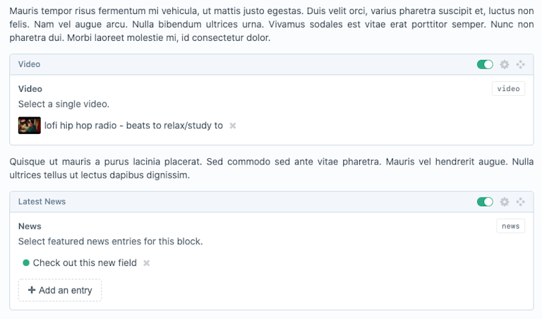
The biggest benefit is being able to mix content with blocks. Think of being able to drop in any Matrix block into your content, to provide any sort of field configuration.

The settings for a field are also pretty powerful, allowing you to group blocks into groups. Each block can have multiple tabs, and utilise existing fields, set field widths - even use Craft UI elements.

More importantly, you can also tie a Twig template partial to each block. This allows you to create modular template code that's coupled to the block, rather than the field, or a particular Twig template that might be using that field. We like organised things!
You can also infinitely nest Vizy fields. Of course, nested Matrix fields is something the Craft community has been crying out for some time, and whilst this doesn't aim to solve that, is still a pretty neat feature!

Nested Vizy fields - oh my!
There's plenty more packed into Vizy:
- Give blocks icons! Font Awesome (opens new window) is bundled, but you can also provide your own icons.
- Performance benefits, compared to Matrix/Neo. A single database call to fetch the JSON blocks for a Vizy field.
- Querying support - just like you're used to with Matrix fields. You can even query to grab all the Paragraph blocks for a field.
- Provide config files to manage what editor buttons, and in which order they're shown.
- Complete template control or "let Vizy handle it"
In closing...#
That about wraps it up. It's difficult to fully convey the difference Vizy makes to content editing without getting your hands on it and using it within a Craft install. We hope you'll give Vizy a go and we'd love to hear what you think!
Get Vizy from the plugin store (opens new window), or get in touch wth Github (opens new window).
