

Plugin Kit 2 (opens new window) is available now, bringing our Craft control panel components to React, Vue, and plain HTML. Add a searchable select to a Twig settings page, build a Vue-powered interface, or keep working in React with the same controls underneath.
When we introduced Plugin Kit, Formie 4 was its main consumer. We had built a React library to handle the components, forms, and Craft integration that a larger plugin interface needs, and wanted other plugin authors to benefit from that work too.
Since then, that foundation has spread across eleven of our plugins. Version 2 takes what we've learned from those interfaces and makes the component library available beyond React.
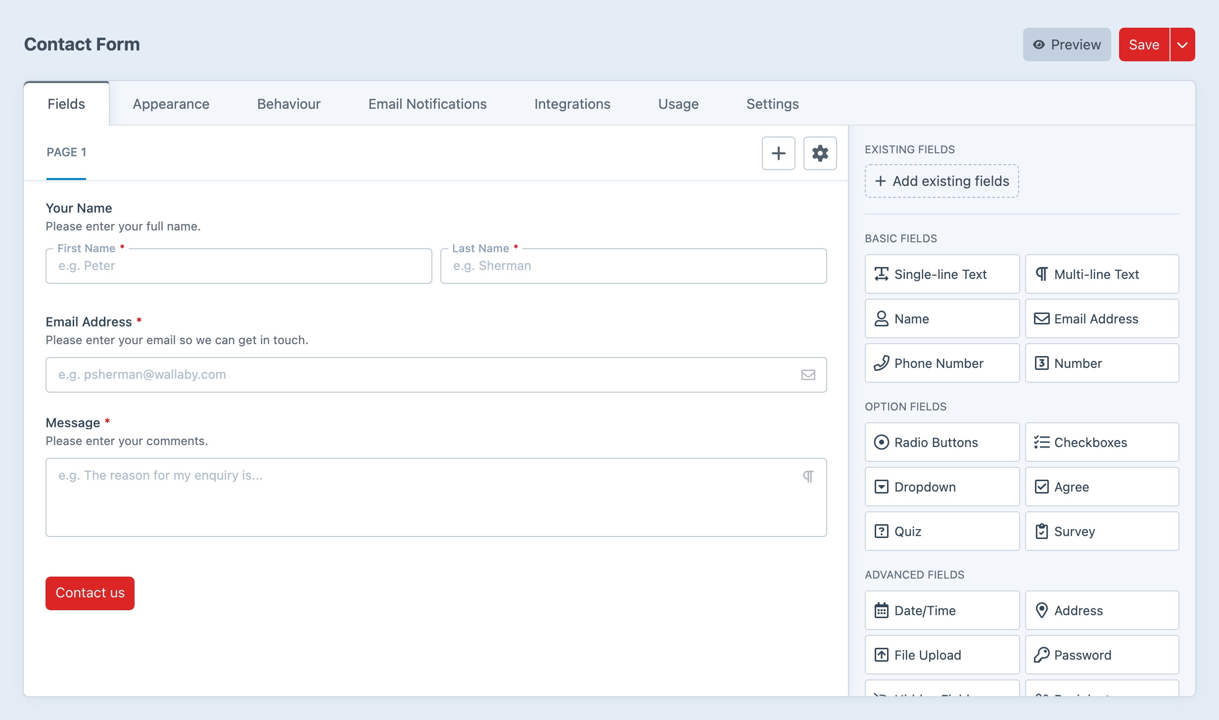
Built Into Eleven Plugins
Plugin Kit now powers interfaces across Formie, Hyper, Navigation, Control Panel Nav, Metrix, Video Picker, Icon Picker, Table Maker, Timber, Comments, and Vizy.
A form builder, a navigation editor, and a field settings screen have different jobs, but they all need dependable menus, inputs, dialogs, and validation. Building those pieces once gives us one place to improve keyboard behaviour, fix a focus ring, or refine a date picker. Plugins can pick up those improvements when they update Plugin Kit.
It also keeps the library grounded in screens we're building and supporting ourselves. As more plugins use it, we're finding which pieces belong in the shared toolkit and which need to stay with the plugin.
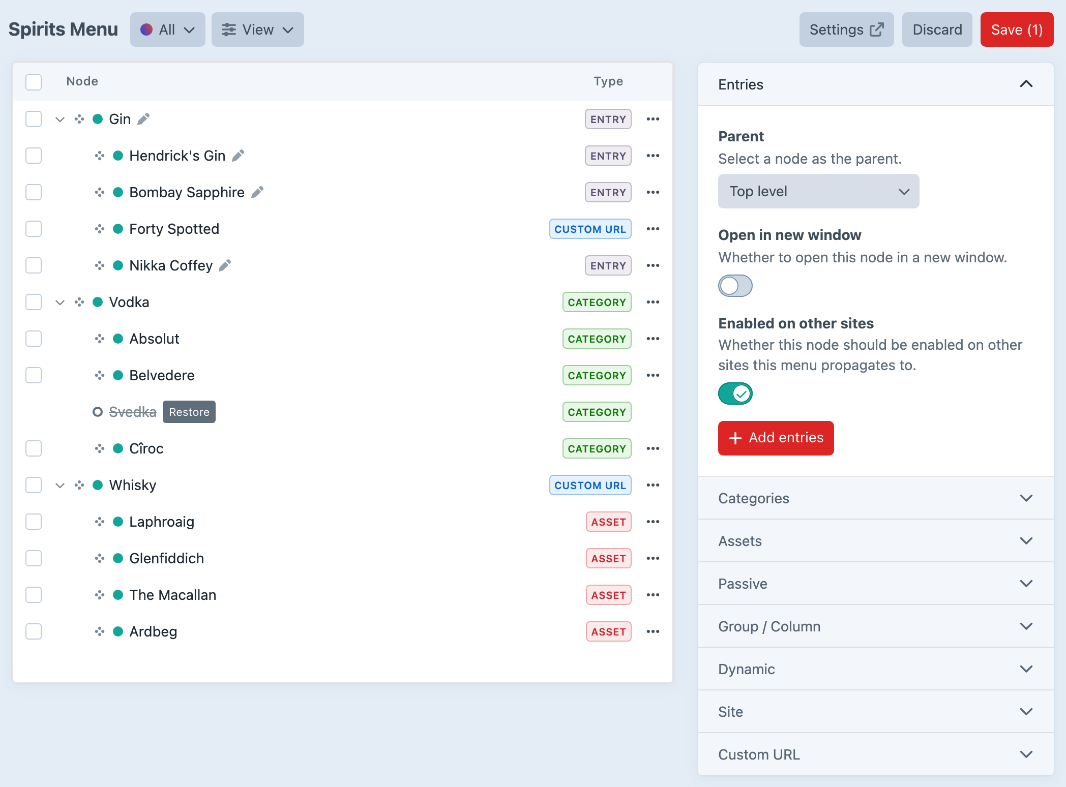
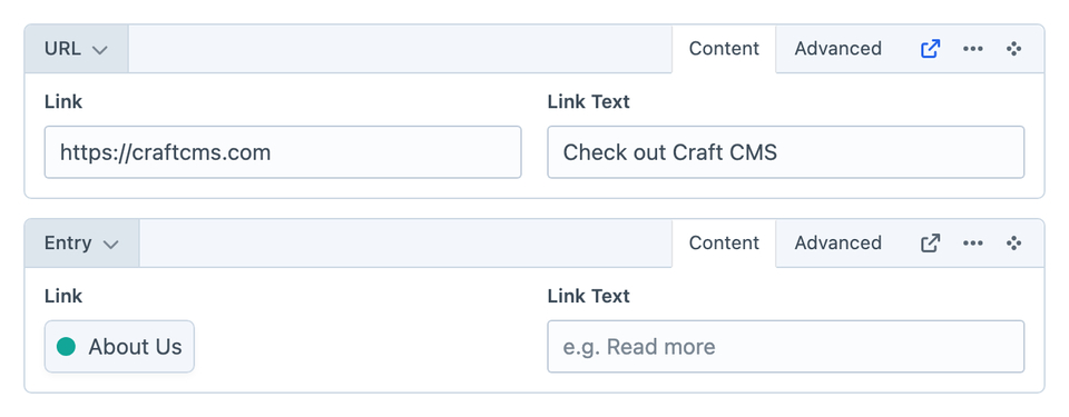
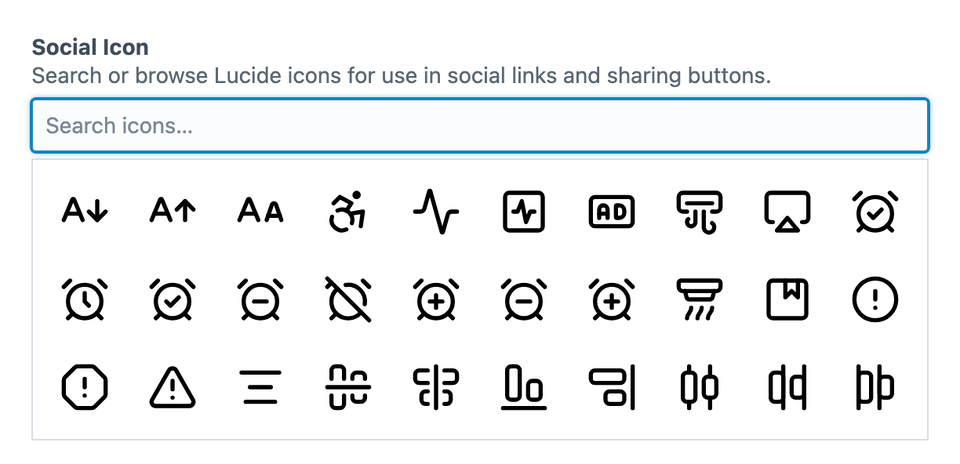
Choose React, Vue, or Twig
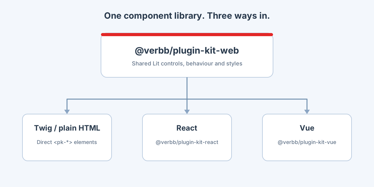
The biggest change in version 2 is where the components live. Their behaviour and styles now belong to @verbb/plugin-kit-web, a library of web components built with Lit. React and Vue packages wrap those same elements so you can use them through familiar framework APIs.
For plugin authors, that means three ways in:
- Twig and plain JavaScript: Render
<pk-*>elements in your templates and load the components the page needs. - React: Use components such as
<Button>through@verbb/plugin-kit-react. - Vue: Use the corresponding components through
@verbb/plugin-kit-vue.
You can choose the approach that suits the screen. A small settings page can stay in Twig. A more involved app can use React or Vue. Each gets the same underlying controls, including their keyboard interactions and accessibility behaviour.
If you want to work directly in Twig without setting up a frontend build, there's also a script-tag loader (opens new window). You host the supplied files in your plugin, and the loader discovers the components on the page and loads them as needed.
Controls That Feel at Home in Craft
The aim is still to follow Craft's control panel patterns wherever they exist. Editors should recognise how to use a settings screen, even when the plugin behind it needs a more involved interface.
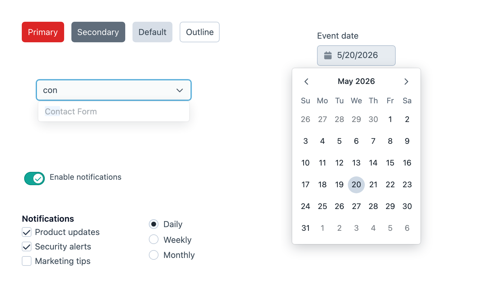
Plugin Kit includes the everyday controls you'd expect: buttons, inputs, lightswitches, selects, tabs, and tooltips. It also covers searchable comboboxes, dialogs, date pickers, editable tables, and rich-text and code editors.
Those larger controls are where shared behaviour becomes particularly useful. A dropdown needs to work with a keyboard. A dialog needs to manage focus. A settings form needs to show validation errors beside the right fields. These are details every plugin needs, and they take time to get right.
Craft integration is part of the toolkit too. The framework providers handle shared configuration such as translations and portals for floating interfaces. Optional host helpers connect your app to Craft actions and selectors. You can also mount an app inside a shadow root when it needs additional style isolation.
The React (opens new window) and Vue quick starts (opens new window) walk through loading your interface on a Craft control panel page.
Import What Your Screen Needs
Plugin Kit lets you load individual component families. A page using a button doesn't need to import the rich-text editor alongside it.
For a project with a frontend build, a button-only entry can be as small as:
import '@verbb/plugin-kit-web/plugin-kit.css';
import '@verbb/plugin-kit-web/components/button.js';
Once Craft loads that entry and its stylesheet through your asset bundle, your Twig template can contain:
<pk-button variant="primary">{{ 'Save'|t('app') }}</pk-button>The web component quick start (opens new window) covers the build and asset-bundle setup around this example.
TipTap and CodeMirror have separate shared packages, and icons are registered explicitly. Import the families and glyphs you use; the full component registration entry is there when you deliberately want the whole library.
Describe Your Settings With SchemaForm
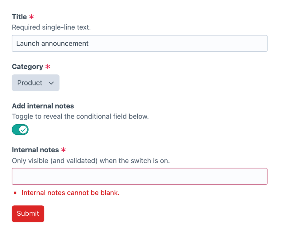
When a settings screen grows to include conditional fields, validation, and server errors, SchemaForm (opens new window) gives you a way to describe those fields as data.
You can define a field in PHP, for example:
$schema = [
    [
        '$field' => 'text',
        'name' => 'name',
        'label' => Craft::t('app', 'Name'),
        'instructions' => Craft::t('app', 'What this section will be called in the control panel.'),
        'required' => true,
        'validation' => 'required',
    ],
];
Pass the schema and values to your frontend integration, and SchemaForm handles the field rendering and form state. The approach should feel familiar if you've used Craft's Twig form macros: describe the field and let the shared controls handle its presentation.
In version 2, the shared engine lives in @verbb/plugin-kit-forms, with React and Vue providing the UI bindings. The same schema structure can serve either framework.
Plugin-specific fields remain extensible. A Formie variable picker can use Formie's own data and rules while taking part in the same form. Those details stay with the plugin that owns them.
For a complete example, the settings screen recipe (opens new window) walks through passing a schema from PHP, rendering it in React, saving values, and displaying errors returned by Craft.
Upgrading From Version 1
On the off chance you'd already taken Plugin Kit 1 for a spin, version 2 includes some breaking changes. Have a look through the 2.0.0 changelog (opens new window) before updating.
Give It a Go
We built Plugin Kit for our own plugins, and it's here for yours too. It's free and open source under the MIT licence, ready for anyone building Craft control panel interfaces.
Start with the documentation (opens new window), choose the Web (opens new window), React (opens new window), or Vue guide (opens new window), and try it on one Craft control panel screen.
You'll find the packages on npm, starting with Plugin Kit Web (opens new window), and the source on GitHub (opens new window). If something doesn't behave as expected, open an issue (opens new window).
We'd love to see what you build with it.